How to get users at Hello
Redesign BUILD first-time user experience
BUILD was struggling to retain new users — only 10% of users returned to BUILD after their first visitng. Based on our research, most of the new users come to BUILD to create their first interactive prototype. These initial prototype creating processes afford the best opportunity for users to familiarize themselves with the ins and outs of BUILD.
The goal is to improve the first time user experience of the prototyping tool, which could reduce the entry barrier to using BUILD, help business experts to spend more time on the core values, and increase the retention rate of BUILD.
BACKGROUND
What is BUILD
SAP BUILD is a complete set of cloud-based tools for business experts to build SAP Fiori apps. https://www.build.me/
BUILD has turned design-thinking from an idea or a way of thinking, into a productized solution to help businesses practice design-led product development and create delightful, useful apps for their users.
My role
I was the design lead who planned, designed and oversaw the project while in charge of the related researches. I initiated the project and raised the priority. I mentored two junior designers and collaborated closely with PMs and devs.

A tale of a broken onboarding
Previously, BUILD project team organized several workshops to show new users how to user BUILD. BUILD also had super detail guidance (which is long and hidden...) Despite these in-person sessions and guidance, we noticed through other researches that many users struggled on their first prototype.
This resulted in frustrated new users, increased their exploring time and the biggest problem of all: many users abandoning BUILD after tried to create their first prototype.
THE PROBLEM
A tale of a broken onboarding
Previously, the BUILD project team organized several workshops to show new users how to use BUILD. BUILD also had super-detailed guidance (which is long and hidden). Despite these in-person sessions and guidance, we noticed through other research that many users struggled on their first prototype.
This resulted in frustrated new users, increased their exploration time—and the biggest problem of all: many users abandoned BUILD after trying to create their first prototype.
BUILD used to hold workshops and hand a print of this long and non-readable guidance to users.
JUMPSTART RESEARCH
What stopped our first-time users
Even we had a sense that the first-time user experience was not working, the unanswered questions seemed endless. What information do new users need, and in what sequence? How do they become familiar with a new tool? What do they expect after they first signed-in to BUILD?
Therefore, I developed a comprehensive research plan to explore what the current first-time user experience of BUILD was like for business experts. We had testings with 12 participants and found that:

Problem 1.
It was hard for the majority of users to understand the purpose of BUILD from its landing page.

Problem 2.
Totally redundant step. Users stated that they wanted to start creating prototypes directly.

Problem 3.
Users didn't know what to expect after they clicked "START PROTOTYPING".

Problem 4.
Users didn't know the difference between the image page and other pages.
They had no idea what the icons and texts meant so they couldn't choose a template to start.
GET BUY-IN
Invite stakeholders to be note-takers
Since this was the project that design wanted to initiate, we needed to communicate the idea to Project Managers. To get them onboard with the problems and the value of improving the process, we needed not only research data but also let them experience the struggles with users together.
Instead of presenting the report out only, I invited PMs to be the note-takers of some research sessions. They sat with the participants and saw one participant struggle for five minutes, which was more impressive than the “5/12 participants struggled for more than 5 mins” text in the report out.

After the research, PMs naturally agreed that we needed to improve the first-time user experience and that the priority should be high.
DESIGN PRINCIPLES
Define the widely applicable guidelines with stakeholders
I led the design brief workshop with PMs and other stakeholders to figure out the problems that we would like to focus on and the design principles for this project:
Simple/intuitive
Using BUILD for the first time should be super smooth and effortless.
Self-explanatory/invisible
The first-time user experience shouldn’t get in the way of our users, it should add to their knowledge and help them through. Advanced users won’t appreciate a solution that is too much in-your-face.
Useful
The first-time user experience should show users something that matches their needs, they should taste the valuable parts of Build that fit in their job responsibility.

EARLY EXPLORATIONS
Always start with pen and paper
Based on the areas of failure and the design principles, I listed out three “How Might We” statements and sketched possible solutions for each of them.
1. How might we shorten the process before prototyping?
2. How might we provide more guidance?
3. How might we help users to find the right template?
1. How might we shorten the process before prototyping?
Through the research, we learned that users wanted to get direct access to the prototyping tool instead of going through the project creation process with some redundant steps. To solve the problem, I came up with three explorations:


One focus point was to explore the possibility of changing the existing information architecture so that users could generate prototypes outside of the projects.
All the concepts above skipped the step that forced users to fill in the name and description of the project or other artifacts (persona, prototype, and study). Users could name a project or artifacts any time they wanted to. They could also leave it untitled.
2. How might we provide more guidance for
first-time users?
I came up with the idea to separate the starting point for image prototyping and hi-fidelity prototyping. It perfectly connected with the previous design for rapid prototyping which wasn't implemented because of the tight schedule and priority changes. I got another chance to push the design into the development cycle.

3. How might we help users to find the right template?
I spent the longest time on the ideation part to help users find the right templates. I guided two junior designers who had just joined the team at that time. With the ever-increasing number of templates we planned to introduce into BUILD, we needed to redesign the whole experience of template picking so that it could be could be scaled in the future.

FEASIBILITY CHECK
Prioritize and narrow down ideas
We had several design explorations during the ideation period. We not only shared the early sketches with the design team but also presented several explorations to PMs and devs. After we had collected all the feedback, we used a simple effort/impact matrix to help us narrow down the ideas.

Then with all the stakeholders, we aligned on the following decisions:

Iterate, iterate, iterate!
I worked closely with two designers, Memie Huang, and Rachel Lin. We included all the design decisions mentioned above into the flow. We went through several iterations to define the flow.

NEW DESIGN
Introducing new first-time user experience

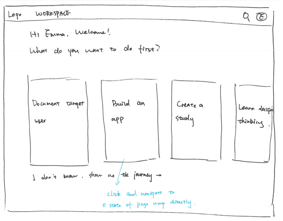
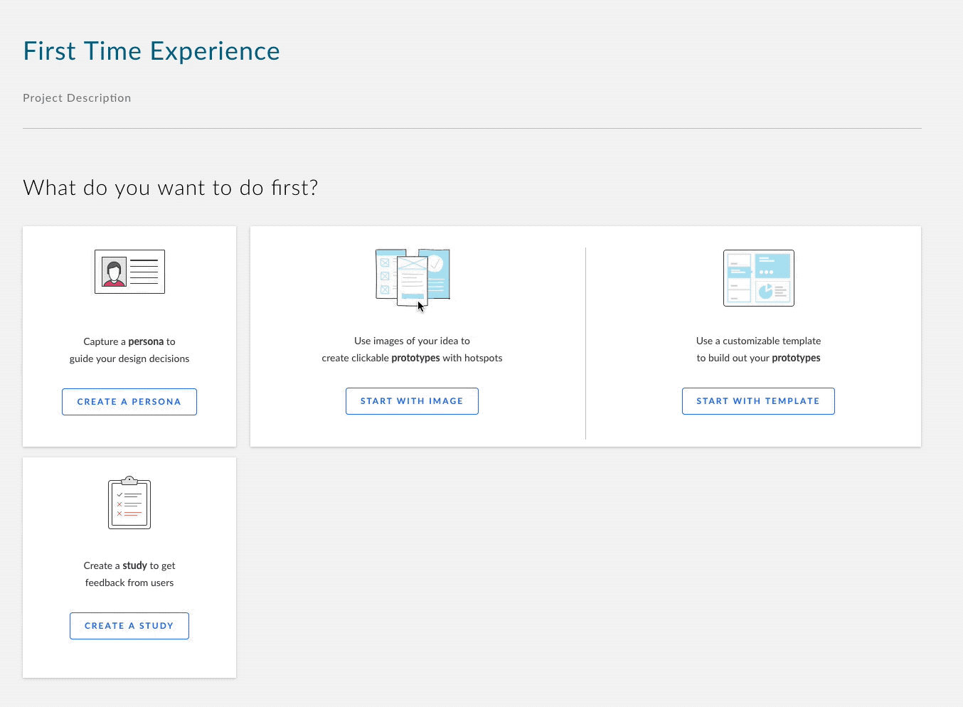
1. Direct access to the tools
First-time users get a sense of the available tools at one glance. We also communicated the concept of the project visually.
Users could start creating a persona/study/prototype directly right after they signed in to BUILD. They could entirely skip the project creation process.

2. Use animation to provide a guide
The new design utilized the project page to communicate the image prototyping and hi-fidelity prototyping features to our users.
Instead of using static illustrations, my co-worker, Memie, designed the animation to help users understand the image prototyping and hi-fidelity prototyping, and the differences between them.
3. Help users find the appropriate templates to jumpstart

USABILITY TESTING
Usability testing results were positive
-
Users liked the fact that they could gain access to the prototyping tool easily.
-
The animated icons help to tell the difference between rapid prototyping and hi-fidelity prototyping.
-
The new design of the template pages improved their usability.

Validating our design solutions through user testing especially gave us confidence in our design decisions.
But there’s still so much to be done! This project solved the problems prior to prototyping, the other project: Simplify the manipulation of BUILD UI controls improved the experience when users are using the hi-fidelity prototyping tool.
The impact
Faster and simpler working process
With the new design, we simplified the first-time user experience before users start prototyping in Build, which saves at least two steps in the process. The new design also provided in-context guidance for first-time users to help them through the process.
Easier user on-boarding
Since the separation of the low-fidelity prototype and hi-fidelity prototype, the discoverability of low-fidelity prototyping has no longer been a problem. It was now clear that Build provides two separate prototyping methods, and the new design improved the usage of both. What’s more, the changes to the templates tile showed more valuable information. Therefore, it was easier for users to select the appropriate one for their prototype. Some of them did not even know about SAP design guidelines.
My reflections
Collaborate closely with the stakeholders to gain buy-in
Since I initiated the effort, it was essential to align with the stakeholders, so they agreed with the priority and wanted to make the improvements.
1. Invited key stakeholders to be the note-takers for the research
2. Organized the design brief workshop
3. Shared early sketches with stakeholders
Don't drop the ball
Working in a large product team, sometimes it was hard to push the design into the development cycle. There were many reasons for this: time or technical limitations, priority changes, and so on. However, as designers, if we truly believe the solution, or if usability testing has proved it, then we should not drop the ball. None of the design within the product is isolated; every user story could connect with others. We got the chance to promote the design again and again with the first or other priorities, and we should not lose it.